Lift 3/12 was lifted from Marnie Flores
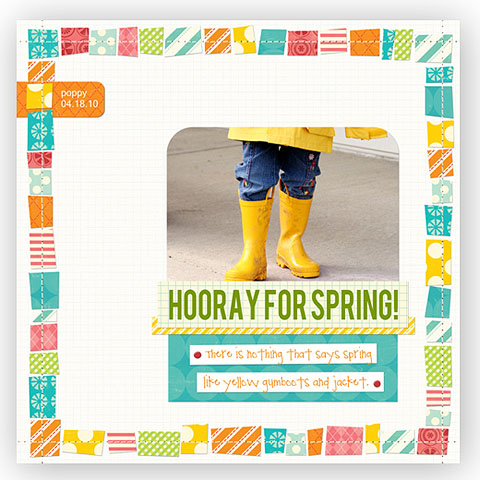
and here is my interpretation highlighting my daughter and her best friend:
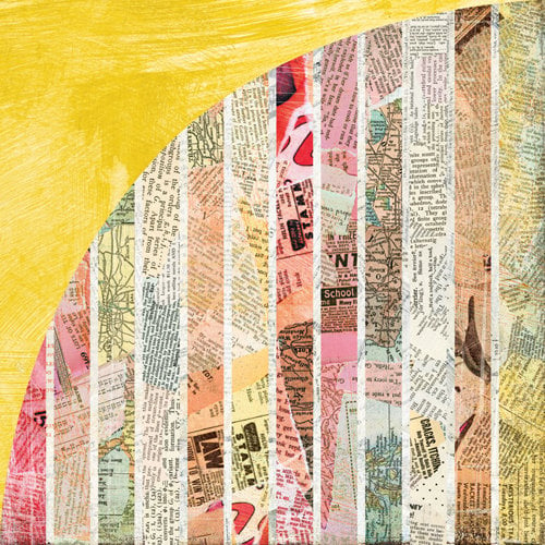
I decided to take the easy way out and instead of cutting out all those squares I used the below shown paper and made sure that I cut strips that included all of the distinct patterns on it. and Voila the square look without all the work!
Basic Grey-Out of Print
Lift 3/13 was much more difficult for me. The challenge was to lift something from each of the two layouts below and make our own layout out of it. The two things I chose were the only two things that just spoke to me at the time. Here are the two that were given:

By Keren and Steffanie from the Scrap Fit DT
and
here is my interpretation featuring photos of me, my husband and my daughter toughing out the downpour at my son's first football game for the season:
I only loosely filled the requirments by stealing the two photo idea from the first layout and the writing directly on the paper idea from the other. It wasn't really much of a lift other than that- but hey it's done!
Thanks for looking at both layouts!


Your layouts are beautiful! I especially like the way you did #2 with the squares. :-)
ReplyDeleteI have had that layout from Marnie in my Pinterest board for a long time, I love it and I love how you made it your own. The tones of the papers you used are perfect for that photo. The second page made me smile! Your daughter looks like she wants to be somewhere else so badly!!! :)
ReplyDeletethese are great! Love your clever way to get the squares!
ReplyDeleteI need to scrap lift that first one!! Love how you used the BG paper!
ReplyDeleteWhat a clever way to do the squares.
ReplyDeleteGREAT lift! I love how you used the Basic Grey paper, very clever!
ReplyDeleteI love your lifts! The first one is awesome and such a good idea to cute the square from the BG paper!! Love your title there too. The second is a great lift too, I commented on it at MS&M.
ReplyDeleteYour layouts are great and so are the ones you took your inspiration from. My fav is the first one.
ReplyDeleteYou did a beautiful job on both of these layout! Smart idea about using the stripes instead of having to cut all those squares! Love Penny
ReplyDeleteBirds of a Feather! I'm tellin' ya that is the perfect title!
ReplyDeleteYour lifts are wonderful and truly "you"! My favorite is the one with the Basic Grey Out of Print. What a brilliant way to get the look without cutting all those little squares! Will have to remember that one :)
ReplyDelete